Bar Graphs and HistogramsPage
2
2
Slide 14
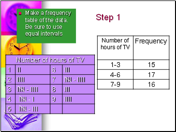
Step 1
Make a frequency table of the data. Be sure to use equal intervals
Slide 15
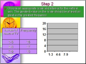
Step 2
Choose an appropriate scale and interval for the vertical axis. The greatest value on the scale should be at least as great as the greatest frequency.
Slide 16
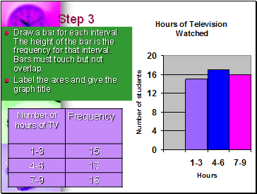
Step 3
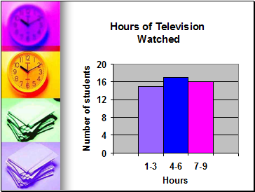
Draw a bar for each interval. The height of the bar is the frequency for that interval. Bars must touch but not overlap.
Label the axes and give the graph title
Slide 17
Slide 18
Can you now make a bar graph, double bar Graph and a histogram?
Slide 19
The list below shows the results of a typing test in words per minute. Make a histogram of the data.
62, 55, 68, 47, 50, 41, 62, 39, 54, 70, 56, 70, 56, 47, 71, 55, 60, 42
Slide 20
The end
Go to page:
1 2
1 2
Contents
- Bar Graphs and Histograms
- Bar Graph
- How to interpret a Bar Graph?
- Double Bar Graph
- How to make a Double-Bar Graph?
- Histogram
- How to make a histogram?
Last added presentations
- Magnetic field uses sound waves to ignite sun's ring of fire
- Direct heat utilization of geothermal energy
- Newton's Laws
- Newton’s Law of Gravity
- Radioactivity and Nuclear Reactions
- Friction
- Sound
© 2010-2024 powerpoint presentations


